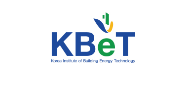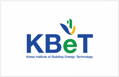
The lowercase letter of the alphabet e was used to mean that the energy is reduced and becomes smaller energy. The energy reduction was visualized by placing an arrow-shaped logo on the e.
The logo symbolizes the shape of an arrow pointing down, showing the goal of KBeT towards zero energy.
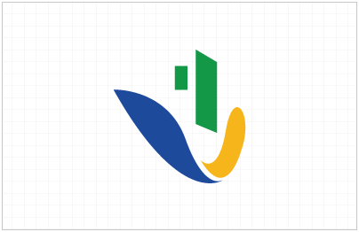
The symbol shaped the windows, walls, and energy lines of the building with eyes, nose, and mouth, respectively. This represents the side of the smiling person’s face, and means that KBeT’s activities make everyone laugh.
The blue and yellow lines that symbolize energy are colored structures surrounding green buildings.
Mixing blue and yellow turns green, which symbolizes the desirable use of energy as an eco-friendly green building.
CMYK – C 98%, M 82%, Y 4%, K 0%
RGB – R 30, G 74, B 156
HEX – #1e4a9c
CMYK – C 85%, M 15%, Y 100%, K 2%
RGB – R 19, G 152, B 72
HEX – #139848
CMYK – C 3%, M 30%, Y 100%, K 0%
RGB – R 246, G 182, B 27
HEX – #f6b61b
Basic Logo Type / Horizontal English Type / Horizontal Korean Type
